Blog Project
Diaqnostic builds AI-powered, personalized environmental health tools focused on air quality and maternal health — operating across North Africa, Sub-Saharan Africa, and South Asia. Their app, Mama's Air Africa, was originally designed for UK and South African markets.
The stakeholder reached out to me directly on LinkedIn with a clear objective: add Tunisia to the app's supported markets. But simply adding Arabic text wasn't enough. True localization means making users feel the product was built for them — their language, their culture, their visual world.
That's the brief I accepted.
Three layers of localization were needed simultaneously:
The primary audience is Tunisian women — specifically those concerned with health, air quality, and maternal wellbeing. This shaped every decision:
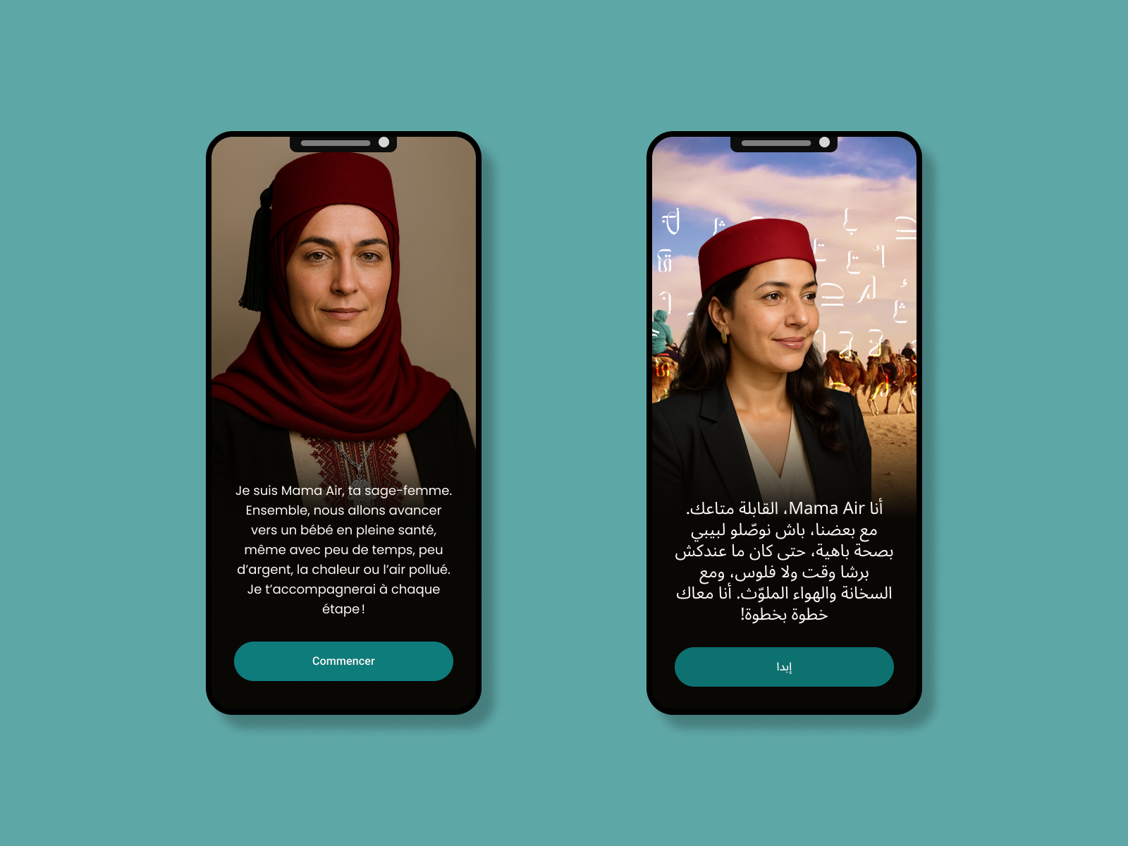
Language: I applied UX writing skills to adapt every string in the app into Tunisian Darja. Not a translation — a rewrite in the voice Tunisian women actually use. French was layered in as the natural second language for this audience.
Visual world: Tunisian women needed to see themselves in this app. A generic North African aesthetic wasn't enough.
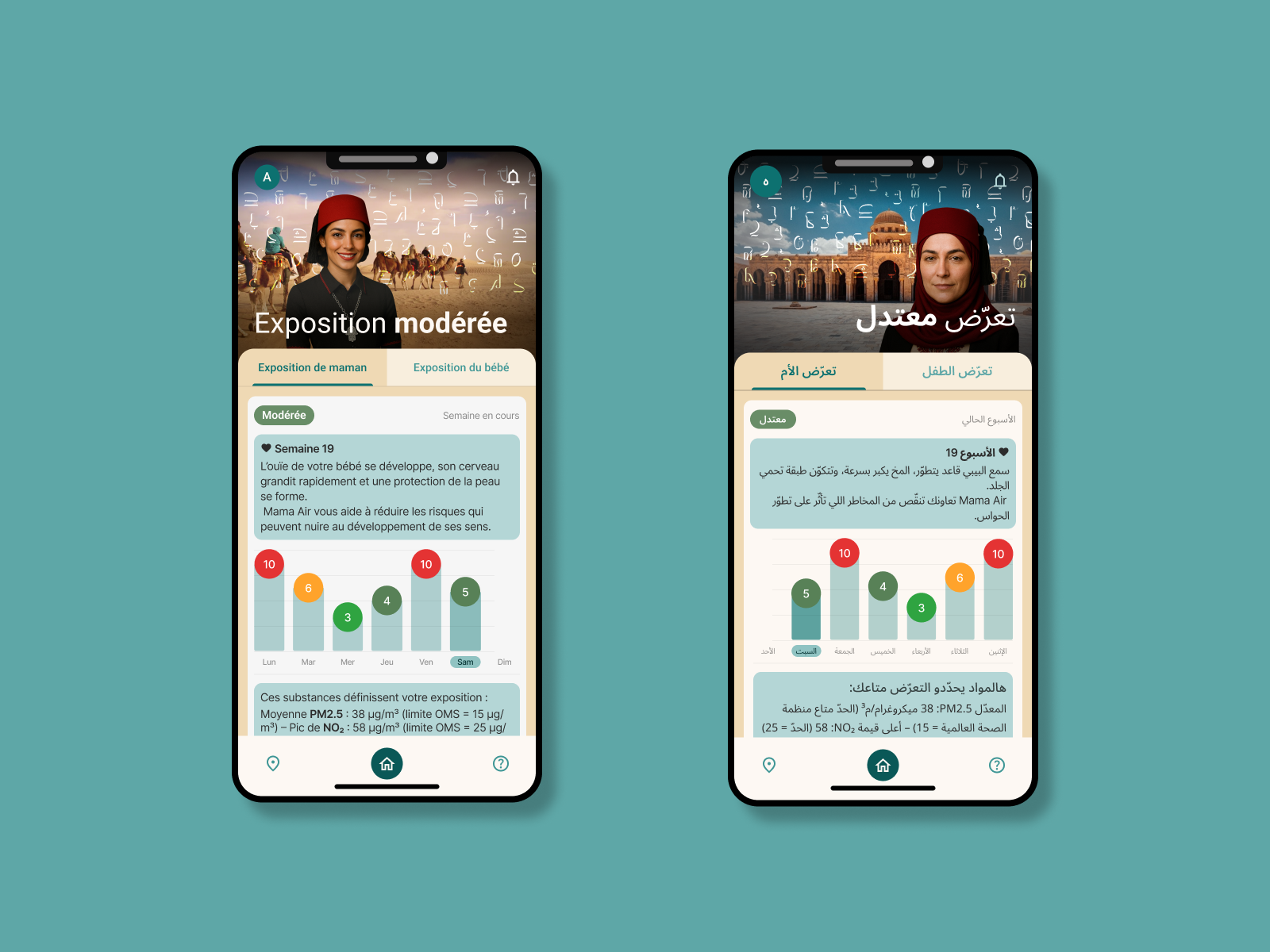
Color: Teal as Primary
Teal was chosen deliberately — not arbitrarily. It sits at the intersection of blue's calming, trust-building properties and green's sense of growth and renewal. For a healthcare app targeting women's wellbeing, this combination communicates:
It also differentiates Mama's Air from the typical clinical blue of most healthcare apps — warmer, more personal, more approachable.
Cultural Illustration: The Tunisian Women Persona
I designed a custom Tunisian women persona illustration — culturally rooted but contemporary. The illustration features:
The background uses Arabic geometric patterns — traditional in form, modern in execution. This creates a visual language that feels both familiar and fresh: something we know, made new.
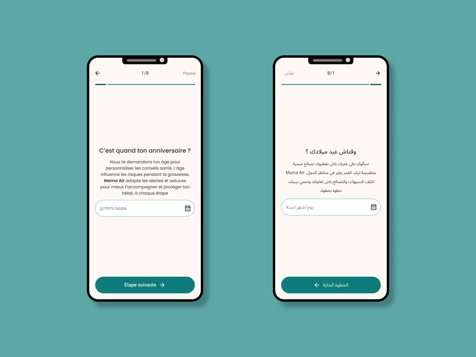
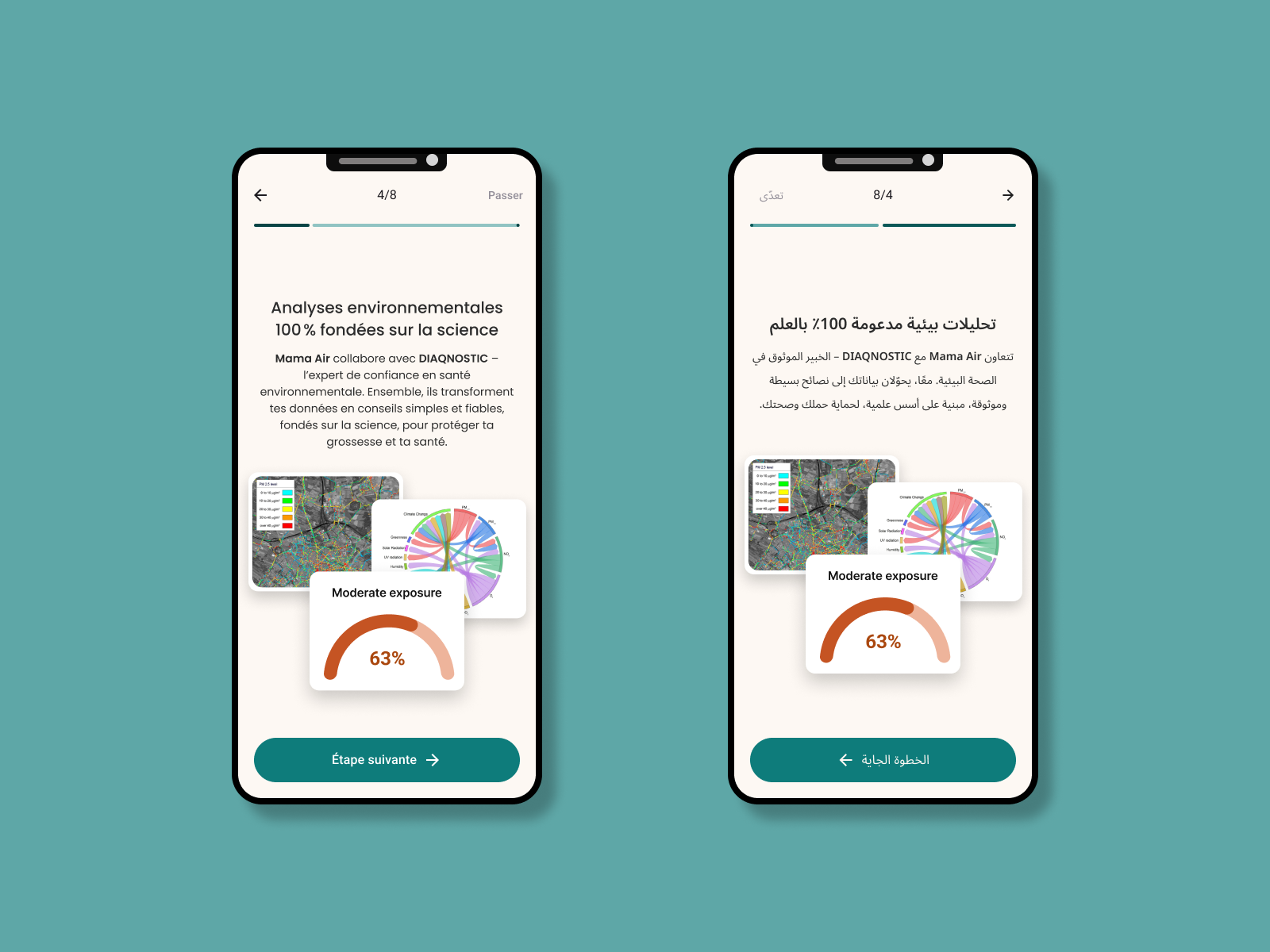
The app features an 8-step onboarding flow. The design principle was simple: users hate typing. Every step was redesigned to minimize text input:
The goal: a user who has never used a health app before finishes onboarding without frustration and with a personalized experience waiting for them on the other side.
The RTL layout wasn't limited to content screens. Profile settings, navigation, form fields, button placement — every component flips direction for the Arabic layout. This is a detail that many apps skip. Tunisian users notice immediately when an app's RTL feels like an afterthought. Here it wasn't.
Full redesign delivered in one week
Complete bilingual RTL/LTR layout — Arabic Darja + French
Custom cultural illustration system unique to the Tunisian market
Dynamic air quality visualization tied to the persona
Frictionless 8-step onboarding with step tracking
Brand consistency maintained with the original Mama's Air identity